20080131
What font says 'Change'?

TYPOGRAPHY CAN subtly or boldly define a company, product, or person. Whether it is Best Buy's big, bold, screaming signs or the sweet, elegant script on a wine label, the type talks to us, the reader. The logos of the presidential candidates are no exception.
Clinton
The Hillary type palette is far from fresh and colorful; it is begging for legitimacy instead of demanding respect. It projects recycled establishment. The type has a tired feeling, as if the ink has been soaking into the page too long. The Hillary logo has the look of an '80s newspaper layout or an investment company. The tall lower-case reminds me of someone with their pants pulled up too high. I wonder about the significance of the three stars and three stripes. A third term?
Edwards
Edwards is the only candidate to use a sans serif typeface for his main typeface. Sans serif typefaces do not have the added elements at the ends of the vertical and horizontal strokes. Unlike many of the traditional sans serifs used in campaigns, Edwards's typeface is open and friendly. It's utilitarian. In past campaigns, Edwards used a serif typeface. Perhaps he is subtly distancing himself from his unsuccessful 2004 bid. The Edwards type is very Wal-Mart, tabloid, middle class. Not a whiff of high-powered lawyer.
Obama
Obama's type is contemporary, fresh, very polished and professional. The serifs are sharp and pointed; clean pen strokes evoke a well-pressed Armani suit. The ever-present rising sun logo has the feeling of a hot new Internet company. His sans serifs conjure up the clean look of Nike or Sony. This typography is young and cool. Clearly not the old standards of years past.
Huckabee
Huckabee has the most inexplicable selection of typography and graphics, from the six floating stars to the white stripe seemingly stolen from the Coca-Cola logo. The overall effect is clutter. The main typeface, used to set the candidate's name, is very tightly spaced, or tightly tracked, as typographers like to say. Some letters, like kab, are actually touching each other. Then "Mike" is tucked in between the H and k as if "we almost forgot to tell you his first name." Setting FAITH. FAMILY. FREEDOM. in such a thin weak sans serif feels as if it was added as a committee compromise or an afterthought. The type is too light, too small, and does not have a real voice.
Romney
Uppercase can attract attention and project boldness, which is probably why the Romney campaign set his name in all caps. It works pretty well for 'Romney'. The letters fit comfortably and form a pretty solid unit.
Unfortunately, MITT does not lend itself well to this treatment. The two T's create a big space between them compared with the space between the MI or, to a lesser extent, the IT. The result is an irregular rhythm and feeling of inconsistency. The graphics are puzzling. The eagle logo has the head of the US Postal Service logo and body of the Norwegian flag flowing behind it. Not sure what that means.
Giuliani
Like Clinton, Giuliani has abandoned his last name nearly completely. Rudy is four easy-on-the-eyes letters set in a strong serif with an eye-catching red border. It is set in a strong, bold serif typeface; the serifs themselves are clear and decisive. Using his short four-letter name allows him to set it particularly large. His message is all about Rudy, name recognition. The enlarged R introduces the other letters like a big, protective parent.
McCain
McCain uses type that is a perfect compromise between a sans and a serif, what type geeks call a "flared sans." Not quite sans and not quite serif, sort of in between, moderate, not too far in either direction. The strokes have contrast between the thick and thin, creating the feeling that the ends are going to have cute little serifs, but they just flare out a little, not forming actual serifs but wanting to. The military star centered and shadowed is a not-so-subtle touchhttp://www.blogger.com/img/gl.link.gif. And McCain just says "President," as if to say he's already been elected. Everything about this logo says you can buy a car from this man. From the perfectly centered star to the perfectly spaced type, the entire design looks like a high-end real estate company. McCain has done something no other candidate has done, he uses all blue, no red - not even a dash. If we were to predict the results based on typography and design, we would pick McCain and Obama.
By Sam Berlow and Cyrus Highsmith
January 27, 2008
[Sam Berlow and Cyrus Highsmith work at The Font Bureau Inc. of Boston. Berlow is general manager; Highsmith is a senior designer.]
© Copyright 2008 Globe Newspaper Company.
link
via
Labels: Design, Logos, Newspapers, Politics
20080130
'Há dias...
... em que sabemos que não podemos abandonar o casulo.'
"Garden of Selves"
'Há outros...
... em que nos julgamos heróis.'
"Burn Season"
link
via
Labels: Photography
Urban fabric
"(...) there really is no perfect form of street fabric - many different networks and patterns are capable of producing wonderful places and being friendly for pedestrians as long as their fabric allows frequent and comprehensive linkages - there simply seems to be an upper scale beyond which all hope of efficient (and therefore popular) pedestrian circulation is gone."
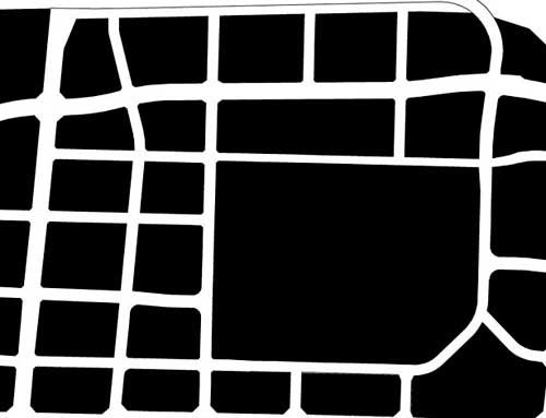 MISSISSAUGA: “Long blocks and virtually empty sidewalks”
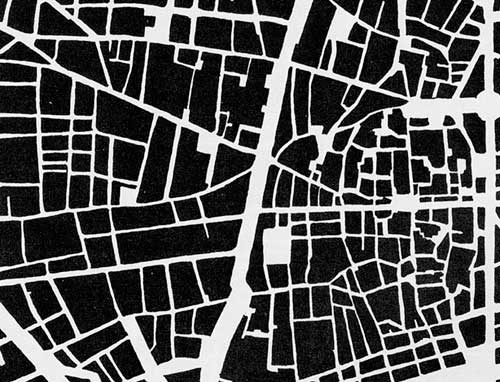 BARCELONA: “La Ramblas is the main north-south promenade”
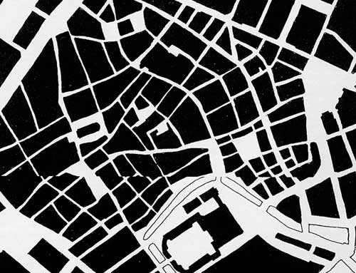 COPENHAGEN: “City features a car-free zone called the Stroget”
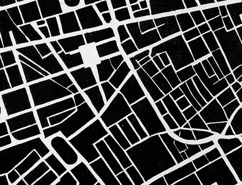 LONDON: “The Mayfair and Soho districts south of Oxford St”
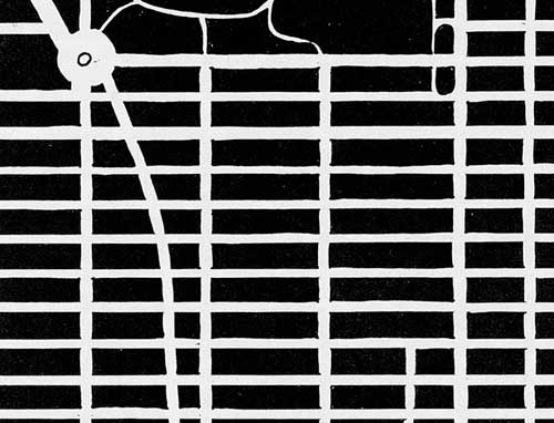 NEW YORK: “Midtown Manhattan south of Central Park”
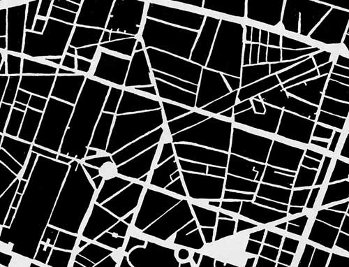 PARIS: “Streets were designed by Georges-Eugne Haussmann”
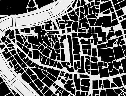 ROME: “East of the Tiber River bend that points to the Vatican”
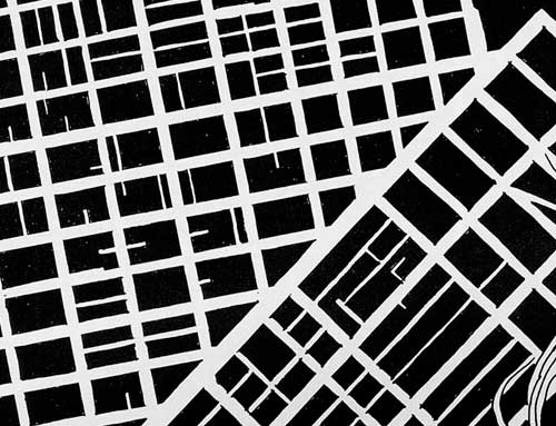 SAN FRANCISCO: “Market St splits the central city into two grids”
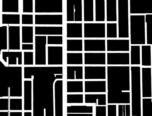 TORONTO: “Between Queen and College Sts east of Bathurst”
link
via
20080129
20080128
20080127
(re)post #5 "GREAT ESCAPE"
© Animation: Alex Produkt / Kathleen Weldon.
© Music: Patrick Watson
Labels: Animation, Illustration, Music
20080125
20080124
Hummmmmmm....
Ele.
Ele escreve muito bem. Ele faz-me rir. Ele leva-me às lágrimas. Ele está atento. Ele é sensível. Ele é acutilante. Ele é criativo. Ele tem preconceitos. Ele não tem preconceitos. Ele é catalisador. Ele tem coragem. Ele é pretensioso. Ele irrita-me. Ele é inebriante. Ele é desarmante.
Gosto [do blog] d'Ele, à bruta!


